
Our World in Data: Catnip for the Curious
A Resource from Oxford University, filled with fascinating data

One of the ways I fear AI will alter our information-seeking habits (and ultimately make us less curious, less intelligent, and more lazy) is by giving us “answers” at the tap of a button. If ChatGPT, or Perplexity.ai, or Google Gemini spews back what we want to know, we’re satisfied.
The Lint Trap originated in the idea that there exists numerous databases and digitized materials on the web that serve a purpose beyond providing training for large language models. I fear the day when these websites, with all their archival information and digitized materials scraped and processed for AI, become abandoned by their creators. So this blog is my (small) attempt to chronicle and enumerate some of those websites I’ve found that offer deeper and more diverse material (and answers) than those simply obtained through AI. I’m a trained historian, and I love archives, and I fear for their future.*
One aspect of information production, and distribution that the web has advanced tremendously in the past three decades is informatics. For those of us who remember 1980s USA Today infographics, the revolution in how much data can be illustrated and visualized (and now: fully animated) is remarkable. When you look around, you can find wonderful datasets and infographics free and open to the public on the web. Many cite and attribute their sources properly (so you can double-check), although I’ve noticed a lot of garbage now being processed to mislead people through social media distribution (lies, damn lies, and statistics, as Mark Twain supposedly once attributed to Benjamin Disraeli).
Today for the Lint Trap, I want to draw your attention to Our World in Data, an Oxford University website
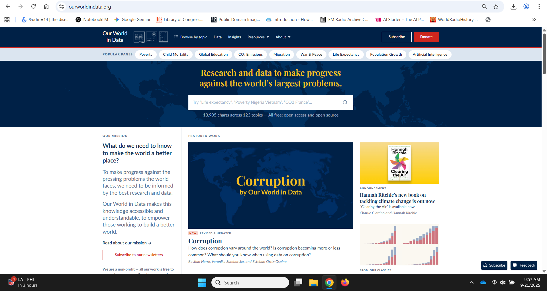
As you can see on the toolbar, there many ways to browse the website. Next to “Popular Pages” is listed “Poverty” “Child Mortality” “Global Education” “CO₂ Emissions” “Migration” “War and Peace” “Life Expectancy” “Population Growth” and “Artificial Intelligence.”
I clicked on “Artificial Intelligence” and on that webpage you’re provided with the latest datasets, research, writing on the subject, and infographics.
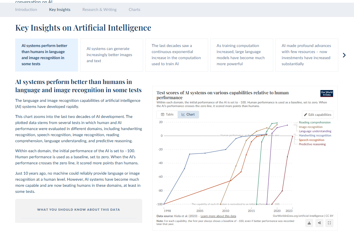
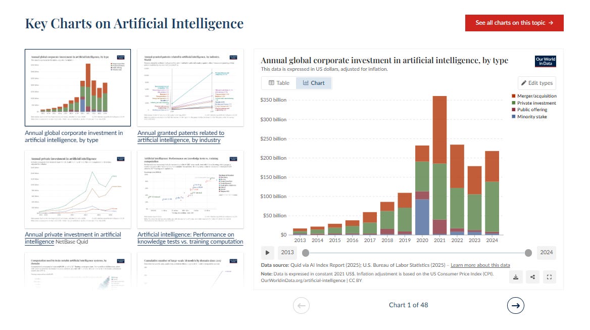
Let’s say I needed to create a presentation about the (general) impact of Artificial Intelligence on Journalism. I’d begin my presentation with an overview of insights offered here, and include several of the graphics (all properly and appropriately attributed). That’s for teaching. But this website is also full of important evidence for support in writing and research. It’s also catnip for the curious.
O.K., this entry is already too long. But I also want to point to a place where I’ve also found some fascinating crowd-sourced informatics - the Data is Beautiful subreddit ( /r/dataisbeautiful ). While many of the examples can be amateurish and useless (and misleading) because of the lack of citation, it’s more catnip for the curious about our world. One engaging aspect of the Data is Beautiful subreddit that makes it reminiscent of the old web bulletin boards - where people discussed and argued about a topic - is the feedback in the Reddit threads below any of the graphs.
Go have a look around Our World in Data or Data Is Beautiful. I think you’ll find them useful, interesting, engaging, amusing, educational, and informative.
*Note: A Microsoft Research Study, titled, “Working with AI: Measuring the Applicability of Generative AI to Occupations” (September 9, 2025) listed “Historian” as the occupation that’s second-most threatened by Artificial Intelligence (after “Interpreters and Translators”). The study was summarized in Axios, which incited much social media discussion and sparked an interesting debate. For a response to the study, see: John Masko, “AI Won’t Replace Historians” Wall Street Journal, August 17, 2025.